Multiple Choice Questions
Q1: A histogram has a class interval 40-60, and its rectangle height is 8 units. Another class interval 60-70 has rectangle height 16 units.
If the intervals are unequal, which class has higher frequency density?
(a) 40-60
(b) 60-70
(c) Both equal
(d) Cannot be determined
Ans: (b)
Explanation: In a histogram with unequal class widths, the height of each rectangle represents the frequency density (frequency ÷ class width) according to the chosen vertical scale. Here the given rectangle heights are 8 and 16 units. Comparing these heights shows that the rectangle for 60-70 is taller (16 > 8), so its frequency density is larger. If one instead treats the given numbers as raw frequencies, dividing by class widths (40-60 has width 20, 60-70 has width 10) gives densities 8/20 = 0.4 and 16/10 = 1.6, and again the class 60-70 has the higher density. Thus 60-70 has the higher frequency density.
Q2: In a frequency polygon, if two consecutive class midpoints are incorrectly taken as 2 units closer, what happens to the polygon?
(a) Only the height changes
(b) Only the width changes
(c) Slope becomes steeper or flatter
(d) It becomes impossible to draw
Ans: (c)
Explanation: Points of a frequency polygon are plotted at class midpoints on the x-axis. If two consecutive midpoints are taken 2 units nearer than they should be, the x-coordinates of those plotted points shift. This changes the slopes of the line segments joining them, making the segment between those points either steeper or flatter compared with the correct plot. Heights (frequencies) remain the same, but the slope is distorted.
Q3: A bar graph compares profit for 12 months. If the scale is changed from 1 cm = ₹5000 to 1 cm = ₹10,000, the effect is:
(a) Bar widths double
(b) Bar heights become half
(c) Bars shift left
(d) Gaps disappear
Ans: (b)
Explanation: The vertical scale determines how much height represents a given amount. Changing the scale from 1 cm = ₹5,000 to 1 cm = ₹10,000 makes each amount occupy half the previous height on the graph. Bar widths and horizontal positions are unaffected; only the bar heights change, becoming half as tall.
Q4: A histogram is used for:
(a) Discrete data
(b) Continuous grouped data
(c) Favourite colours
(d) Names of students
Ans: (b)
Explanation: A histogram represents continuous grouped data arranged in class intervals. Adjacent bars touch, and the height of each bar gives frequency density (frequency ÷ class width). Discrete categories such as favourite colours or names use bar graphs, not histograms.
Q5: A bar graph is drawn using:
(a) Bars of equal width
(b) Bars of unequal width
(c) Bars touching each other
(d) No bars at all
Ans: (a)
Explanation: A bar graph uses bars of equal width with gaps between them to represent distinct categories; the heights show the values (frequency, amount, etc.). Histograms, by contrast, have touching bars because they represent continuous intervals.
Short Answer Questions
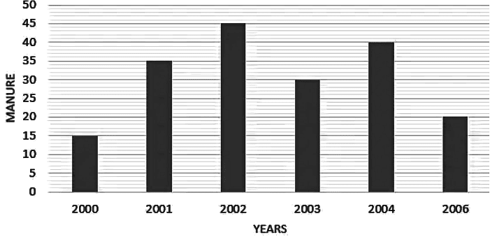
Q1: The following data gives the amount of manure (in tones) manufactures by a company during some years.

- Represent it with a bar graph.
- Indicate with help of bar graph in which year, the amount of manufactured by company was maximum.
Ans: The bar graph representing the given data is shown below. The year with the highest production is the year having the tallest bar in the graph.
Q2: Draw a bar graph for the following data:
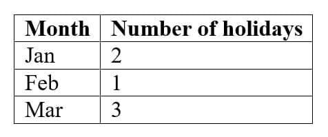
Ans:
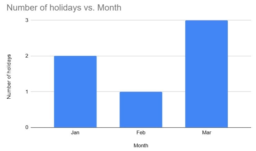
The bar graph above shows the given data; read the tallest or shortest bar to compare values across categories.
Q3: Find the class mark of 20-30.
Ans: Class mark = (Lower limit + Upper limit) ÷ 2
= (20 + 30) ÷ 2
= 25
Long Answer Questions
Q1: Draw a histogram for this data:
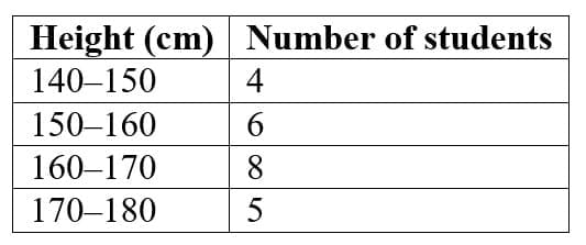
Ans:
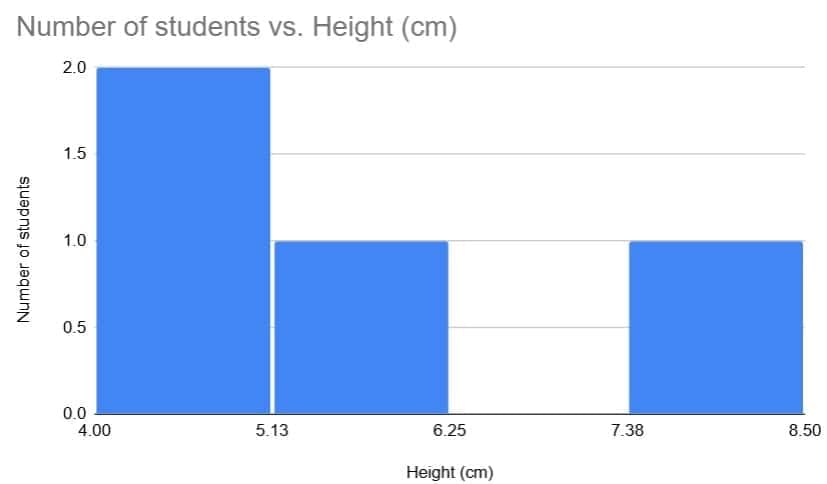
When drawing the histogram, ensure that each class interval is represented by a bar whose width equals the class width and whose height equals the frequency density (frequency ÷ class width) so that areas of bars represent frequencies correctly.
Q2: You are given the following mid-points of a frequency polygon:
20, 30, 40, 50, 60
The polygon rises from (20, 6) to (40, 18), then falls to (60, 4).
(a) Reconstruct the class intervals.
(b) Draw a rough shape description of the polygon.
(c) Explain where the distribution has its “peak” and what it means.
Ans:
(a) To find class intervals from midpoints, use half the class width on either side of each midpoint.
Midpoints: 20, 30, 40, 50, 60
Difference between consecutive midpoints = 10, so class width = 10.
Each interval = midpoint ± 5, giving:
15-25
25-35
35-45
45-55
55-65
(b) Shape
- Plot points at (20, 6), (30, y₂), (40, 18), (50, y₄), (60, 4) where y₂ and y₄ are the intermediate frequencies consistent with the rise and fall described.
- The polygon rises steeply from (20, 6) up to (40, 18), then falls sharply toward (60, 4). This produces a clear single-peaked shape with a steep ascent followed by a descent.
(c) Peak at midpoint 40, frequency 18.
Meaning: The highest point of the polygon is at midpoint 40, so most observations fall in the class with midpoint 40, that is the class 35-45. This class therefore contains the largest frequency compared with the other classes.
Q3: Below is data of girls per 1000 boys in different sections of society:
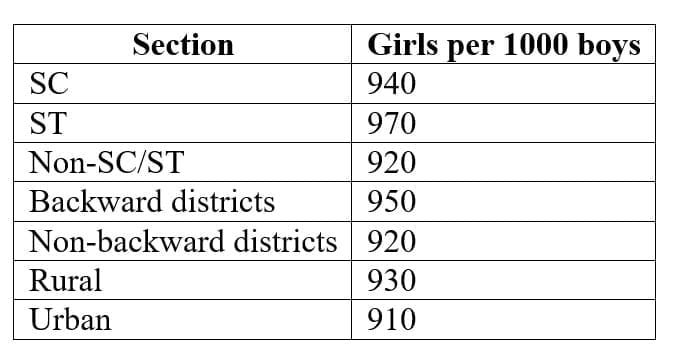
(i) Draw a bar graph for the data.
(ii) Which section shows the highest value?
(iii) Comment on the trend.
Ans: (i)
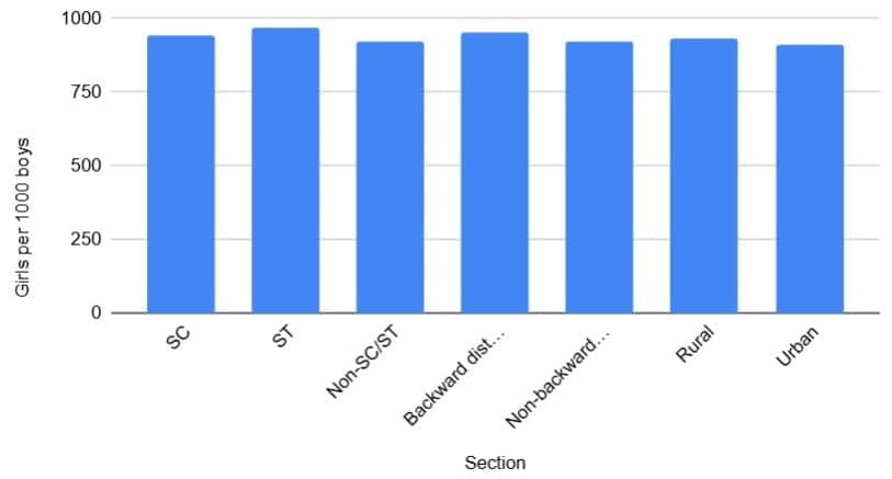
(ii) The ST (Scheduled Tribe) section shows the highest value with 970 girls per 1000 boys.
(iii) From the bar graph we observe the following trend:
- ST has the highest girls-per-1000-boys ratio.
- Backward districts and SC also show relatively better gender ratios compared with some other sections.
- Urban areas show the lowest value (910), indicating a poorer gender ratio in urban regions compared with several rural or tribal sections.
- Overall, the gender ratio varies across sections; tribal and certain backward areas perform better than urban and some other groups.