Multiple Choice Questions
Q1: A histogram has a class interval 40–60, and its rectangle height is 8 units. Another class interval 60–70 has rectangle height 16 units.
If the intervals are unequal, which class has higher frequency density?
(a) 40–60
(b) 60–70
(c) Both equal
(d) Cannot be determined
Q2: In a frequency polygon, if two consecutive class midpoints are incorrectly taken as 2 units closer, what happens to the polygon?
(a) Only the height changes
(b) Only the width changes
(c) Slope becomes steeper or flatter
(d) It becomes impossible to draw
Q3: A bar graph compares profit for 12 months. If the scale is changed from
1 cm = ₹5000 to 1 cm = ₹10,000, the effect is:
(a) Bar widths double
(b) Bar heights become half
(c) Bars shift left
(d) Gaps disappear
Q4: A histogram is used for:
(a) Discrete data
(b) Continuous grouped data
(c) Favourite colours
(d) Names of students
Q5: A bar graph is drawn using:
(a) Bars of equal width
(b) Bars of unequal width
(c) Bars touching each other
(d) No bars at all
Short Answer Questions
Q1: The following data gives the amount of manure (in tones) manufactures by a company during some years.
- Represent it with a bar graph.
- Indicate with help of bar graph in which year, the amount of manufactured by company was maximum.
Q2: Draw a bar graph for the following data: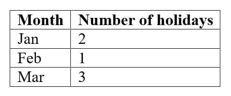
Q3: Find the class mark of 20–30.
Long Answer Questions
Q1: Draw a histogram for this data: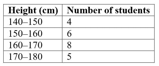
Q2: You are given the following mid-points of a frequency polygon:
20, 30, 40, 50, 60
The polygon rises from (20, 6) to (40, 18), then falls to (60, 4).
(a) Reconstruct the class intervals.
(b) Draw a rough shape description of the polygon.
(c) Explain where the distribution has its “peak” and what it means.
Q3: Below is data of girls per 1000 boys in different sections of society:
(i) Draw a bar graph for the data.
(ii) Which section shows the highest value?
(iii) Comment on the trend.