Worksheet: Data Through Pictures
Q1: Look at the bar graph here: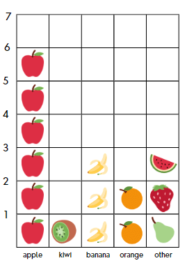 Answer the following questions:
(i) How many more apples are there than bananas on the graph?
(ii) If each fruit represents 2 actual fruits, how many real oranges are there?
(iii) What is the total number of fruits on the graph?
(iv) Which category has the second highest number of fruits?
(v) How many fruits are there in the “other” category compared to kiwis?
(vi) If you add two more oranges to the graph, how many fruits will there be in total?
Q2: The total number of animals in five villages are given below:
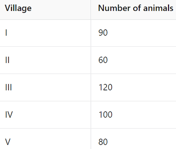
Draw a pictograph to represent the above data.
Q3: The modes of traveling to school by the students of a class are given below: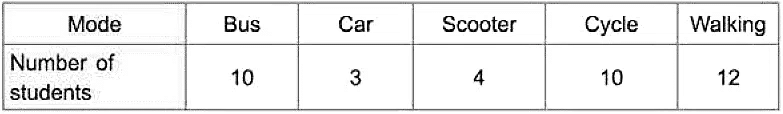
Draw a pictograph to represent the above data.
Q4: The following pictograph shows the number of candles brought by some children of class 4 for a Festival. Each candle represents a set of 4.
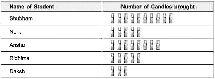
Look at the pictograph and answer the following questions:
(i) How many candles are brought by Daksh? ______.
(ii) Who has brought the maximum number of candles and how many? ______.
(iii) How many candles are brought by Anshu? ______.
(iv) Name the two students who have brought the same number of candles.
Q5: The different types of trees planted in a park are given below:
Draw a pictograph to represent the above data.
Q6: The sale of toys in a toy shop during the weekdays of a particular week is given below. Draw a pictograph to represent the following data.
Each circle represents 4 toys
Q7: The following bar graph shows favourite colour of students of class IV.
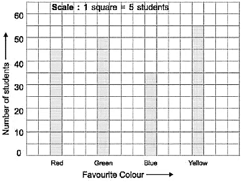
Look at the bar graph and answer the following:
(i) How many children like green colour?
(ii) Which is the most favourite colour of the students of class IV?
Q8: The following bar graph shows the favourite picnic spots of children of a class. Look at the bar graph and choose the correct answer:
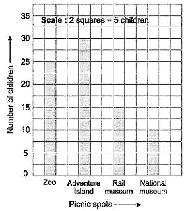 (i) Which destination is liked by maximum number of children?
(ii) How many children would like to go to Adventure island?
(iii) How many children would like to go to Rail Museum?
Q9: The bar graph shown below represents marks obtained by Abhijit. Look at the bar graph and answer the following questions:
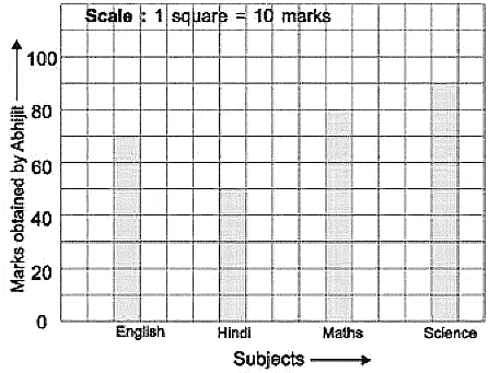
(i) Find the total marks obtained by him out of 400.
(ii) In which subject Abhijit got the highest marks?
(iii) In which subject Abhijit got the lowest marks?
Q10: The bar graph shown here represents different means of transport used by students of class IV-A to come to school.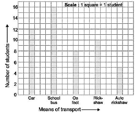
Study the bar graph and answer the following questions.
(i) How many students come to school by autorickshaw?
(ii) How many students come to school by car?
(iii) Which mode of transport is used by maximum number of students?