Introduction
Imagine making a poster so eye-catching that everyone stops to read it, whether it’s for a school event, a cleanliness drive, or a fun family party! In this chapter, we’ll learn how to design posters and invitation cards that grab attention and share important messages. Using cool design tricks like emphasis and order of importance, you’ll create artwork that not only looks awesome but also inspires others to act, like keeping the classroom tidy or staying safe on the road!
Purpose of Posters
Posters are powerful tools to inform, invite, or raise awareness for events like school functions, family celebrations (e.g., birthdays, weddings), or causes like road safety, personal hygiene, cleanliness, or good habits. They blend eye-catching visuals with clear, concise words to quickly communicate messages and positively influence people’s thoughts or actions, making them memorable and effective.
Try yourself:
What is one purpose of posters?
- A.To play music
- B.To take photos
- C.To inform or raise awareness
- D.To serve food
View SolutionBasics of Poster DesignEffective posters use a combination of images and text to capture attention and deliver a clear message. Key elements include striking visuals (like a bold picture), concise text (like a short slogan), and a well-organized layout that highlights the main idea, ensuring it’s easy to understand and sticks in the viewer’s mind.
Design Principle: EmphasisEmphasis is a design principle that draws the viewer’s focus to the most important part of the poster, such as the event name or a key image. This is achieved through larger sizes, bright or contrasting colors, or techniques like bolding, underlining, or highlighting text or visuals, ensuring the main message stands out clearly.
Tip: Use a bright color or large size for the main message to catch eyes first.
Design Principle: Order of Importance
The order of importance, organizes poster elements by priority to guide the viewer’s eyes in a planned sequence. For example, in a missing pet poster, the pet’s photo and the word “missing” are largest to grab attention first, while contact details are smaller but still essential, creating a clear flow of information.
Tip: Place the most important element at the top or center to guide attention.
Try yourself:
What should be the largest element on a missing pet poster?
- A.Location details
- B.Contact details
- C.Pet’s photo
- D.Description of the pet
View SolutionCreating Effective Posters
To create a strong poster, plan a layout to position text and images, ensuring the most important element is emphasized. Use a clear, concise message with correct grammar and spelling, and incorporate a border or guidelines for neatness. Vibrant colors, detailed visuals, and a balanced layout enhance the poster’s visual appeal and impact.
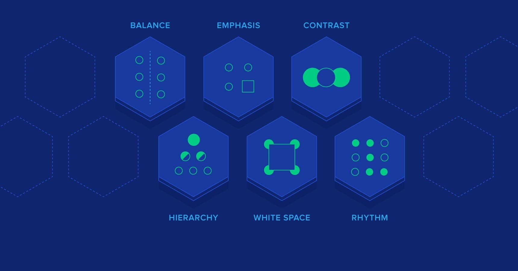
Applying Design Principles Beyond Posters
Design principles like emphasis and hierarchy are used in advertisements, invitation cards, and newspapers, where headlines are large and bold for priority, and less critical details are smaller. These principles ensure clarity and impact in various forms of visual communication, from magazine ads to event flyers.Conclusion
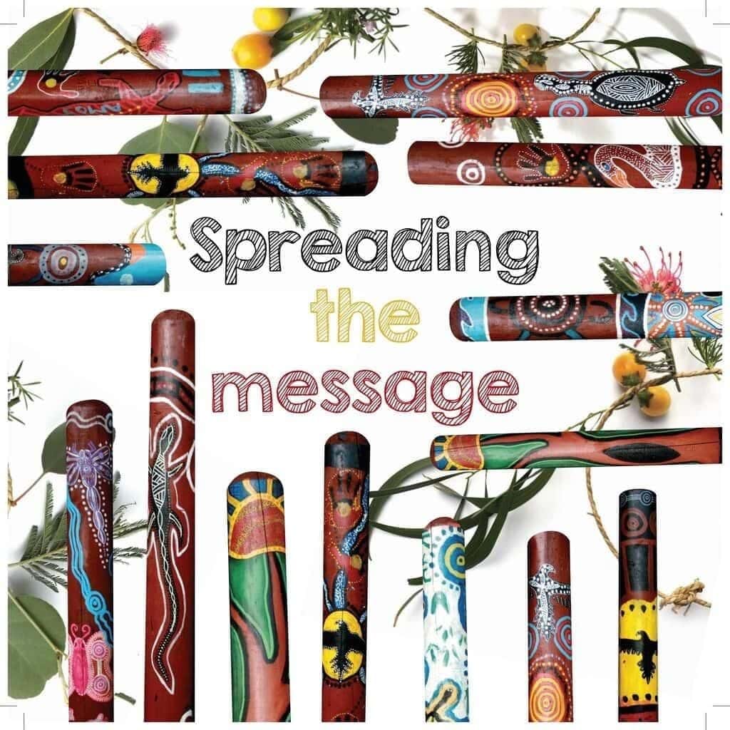
This chapter shows how to spread messages through vibrant posters and invitation cards, using design principles like emphasis and hierarchy. By thoughtfully arranging visuals, text, and layouts, we can create artwork that informs, inspires, and connects with others, whether for school events, safety reminders, or joyful celebrations!
Important Vocabulary
- Poster: A visual tool using images and text to inform, invite, or raise awareness.
- Emphasis: A design principle that highlights one part of a poster to focus attention.
- Order of Importance (Hierarchy): Organizing elements from most to least important to guide the viewer’s eyes.
- Layout: The arrangement of text and images in a poster or card to communicate effectively.
- Invitation Card: A designed card to invite people to events like weddings or birthdays.
- Foreground: The closest part of a picture, with bold details.
- Middle Ground: The area behind the main subject, adding depth.
- Background: The farthest part of a picture, with lighter colors and fewer details.