Page No. 98-99
Math Talk
Q: Which of the following are statistical questions?
(a) What is the price of a tennis ball in India?
Ans: This is not a statistical question.
This question expects a single specific answer. The price of a tennis ball may vary slightly by brand or location, but the question asks for “the price” (singular), not about variation in prices.
(b) How old are the dogs that live on this street?
Ans: This is a statistical question.
Different dogs will have different ages. We would need to collect data on each dog’s age and then analyse the variation in ages. We expect variability in the answer.
(c) What fraction of the students in your class like walking up a hill?
Ans: This is a statistical question.
We need to collect data from all students in the class to find out how many like walking up a hill, then calculate the fraction. This requires data collection and analysis.
(d) Do you like reading?
Ans: This is not a statistical question.
This question is directed at one person and expects a single answer: yes or no. There’s no data collection or variability involved.
(e) Approximately how many bricks are in this wall?
Ans: This is not a statistical question.
Although the word “approximately” is used, this question asks for a single estimate of the number of bricks. We don’t need to collect varying data; we just need to count or estimate once.
(f) Who was the best bowler in the match yesterday?
Ans: This is not a statistical question.
While this might involve looking at statistics, the question asks for one specific answer – the name of the best bowler. However, if rephrased as “How did the bowlers perform in yesterday’s match?” it could become a statistical question because that would require collecting and comparing performance data.
(g) What was the rainfall pattern in Barmer last year?
Ans: This is a statistical question.
Understanding a rainfall pattern requires collecting data over time (daily or monthly rainfall throughout the year), analysing variations, and identifying trends. This involves data collection and analysis.
Page No. 100
Figure it out
Q1: Shreyas is playing with a bat and a ball – but not cricket. He counts the number of times he can bounce the ball on the bat before it falls to the ground. The data for 8 attempts is 6, 2, 9, 5, 4, 6, 3, 5. Calculate the average number of bounces of the ball that Shreyas is able to make with his bat.
Ans: To find the average number of bounces:
The total number of bounces = 6 + 2 + 9 + 5 + 4 + 6 + 3 + 5 = 40 bounces
Number of attempts = 8
Average = Total bounces ÷ Number of attempts
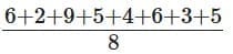
Therefore, Shreyas is able to make an average of 5 bounces with his bat.
Q2: Try the activity above on your own. Collect data for 7 or more attempts and find the average.
Ans: This is a practical activity that students should perform themselves. Here is an example solution:
Example: Suppose I performed this activity and got the following data for 7 attempts: 8, 5, 12, 6, 7, 9, 11
Total bounces = 8 + 5 + 12 + 6 + 7 + 9 + 11 = 58 bounces
Number of attempts = 7
Average = 58 ÷ 7 = 8.29 bounces (approximately 8 bounces)
Note: Students should perform this activity themselves and record their own data.
Q3: Identify a flowering plant in your neighbourhood. Track the number of flowers that bloom every day over a week during its flowering season. What is the average number of flowers that bloomed per day?
Ans: This is a practical observation activity. Here is an example solution:
Example: Suppose I observed a Hibiscus plant for 7 days and recorded:

Step 1: Total flowers = 3 + 5 + 4 + 6 + 4 + 5 + 3 = 30 flowers
Step 2: Number of days = 7
Step 3: Average = 30 ÷ 7 = 4.29 flowers per day (approximately 4 flowers per day)
Note: Students should observe a real plant and record their own data.
Q4: Two friends are training to run a 100 m race. Their running times over the past week are given in seconds – Nikhil: 17, 18, 17, 16, 19, 17, 18; Sunil: 20, 18, 18, 17, 16, 16, 17. Who on average ran quicker?
Ans: Nikhil’s running times over the past week in seconds: 17, 18, 17, 16, 19, 17, 18
Number of days in a week = 7
Average running time of Nikhil = (17 + 18 + 17 + 16 + 19 + 17 + 18) ÷ 7 = 122 ÷ 7 = 17.43 seconds.
Sunil’s running times over the past week in seconds: 20, 18, 18, 17, 16, 16, 17
Average running time of Sunil = (20 + 18 + 18 + 17 + 16 + 16 + 17) ÷ 7 = 122 ÷ 7 = 17.43 seconds.
Both Nikhil and Sunil have the same average running time, so neither is quicker on average.
Q5: The enrolment in a school during six consecutive years was as follows: 1555, 1670, 1750, 2013, 2040, 2126. Find the mean enrolment in the school during this period.
Ans: To find the mean enrolment:
Total enrolment over 6 years = 1555 + 1670 + 1750 + 2013 + 2040 + 2126 = 11,154 students
Number of years = 6
Mean enrolment = Total enrolment ÷ Number of years = 11,154 ÷ 6 = 1,859 students
Therefore, the mean enrolment in the school during this period was 1,859 students. This means that on average, approximately 1,859 students were enrolled each year during this six-year period.
Page No. 102-103
Know Your Onions!
Q: The table shows the monthly price of onions, in rupees per kilogram (kg), at two towns. Where are onions costlier, according to you?
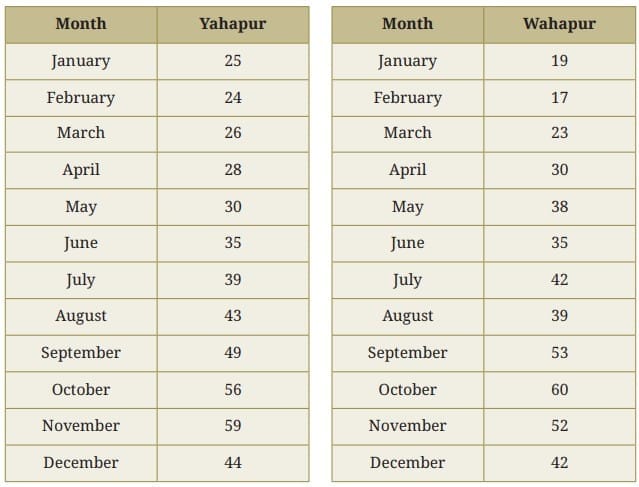
Ans: Let us analyse the data from different perspectives:
Different ways to compare:
Highest price: Wahapur has the highest price of ₹60 (in October).
Total of all months:
Yahapur: 25 + 24 + 26 + 28 + 30 + 35 + 39 + 43 + 49 + 56 + 59 + 44 = ₹458
Wahapur: 19 + 17 + 23 + 30 + 38 + 35 + 42 + 39 + 53 + 60 + 52 + 42 = ₹450
Month-wise comparison:
Yahapur is costlier in 6 months (Jan, Feb, Mar, Nov, Dec, Aug).
Wahapur is costlier in 5 months (Apr, May, Jul, Sep, Oct).
Both have same price in 1 month (June).
Range (difference between highest and lowest):
Yahapur: 59 – 24 = ₹35
Wahapur: 60 – 17 = ₹43 (more variation).
The best way to compare overall prices is to use the AVERAGE (mean) price. Here Yahapur has a slightly higher total over the year and so a slightly higher average, so onions are, on average, a little more expensive in Yahapur.
Page No. 107
Q: Find the mean and median in Poovizhi’s data without the outlier value 118. What change do you notice?
Ans:
Poovizhi’s family heights without the outlier (118 cm): Heights: 170, 173, 165, 175
Calculating the Mean: Total = 170 + 173 + 165 + 175 = 683 cm
Number of members = 4
Mean = 683 ÷ 4 = 170.75 cm
Calculating the Median: Sorted heights: 165, 170, 173, 175
Middle values (2nd and 3rd) = 170 and 173
Median = (170 + 173) ÷ 2 = 171.5 cm
Changes noticed:
- Mean increased significantly (from the previous value of 160.2 cm) to 170.75 cm – an increase of 10.55 cm. This large change occurred because the outlier 118 pulled the original mean down.
- Median increased slightly from 170 cm to 171.5 cm (an increase of 1.5 cm).
Conclusion: The outlier had a huge impact on the mean but only a small impact on the median. This shows that the median is more resistant to outliers and often gives a better representation of the central value when outliers are present.
Q: After the summer vacation, a class teacher asked his class how many short stories they had read. Each student answered the number of stories read on a piece of paper, as shown below. Find the mean and median number of short stories read. Before calculating them, can you guess whether the mean will be less than or greater than the median?

Mark the data, the mean, and the median on the dot plot below

Data Points: 0, 0, 1, 2, 3, 5, 5, 6, 7, 8, 8, 10, 12, 15, 40
Ans: 1. Calculation of Mean:
Total number of students: 15
Sum of all stories read: 0 + 0 + 1 + 2 + 3 + 5 + 5 + 6 + 7 + 8 + 8 + 10 + 12 + 15 + 40 = 122
Mean = Total Sum ÷ Total Students = 122 ÷ 15 = 8.13
2. Calculation of Median:
The median is the middle value in an ordered list.
For 15 students, the median is the 8th position.
The 8th value in our list is 6.
Median = 6
3. Comparison:
The mean (8.13) is greater than the median (6).
This happens because the single high value (40) is an outlier that pulls the mean higher, while the median stays at the middle value and is not much affected.
Page No. 108
Q: Which of the values would you consider an outlier?
Ans: The value 40 is clearly an outlier.
It is significantly different from all other values in the data. Most students read between 0 and 15 stories, but one student read 40 stories, which is more than 2.5 times the next highest common values.
Q: Find the mean and median in the absence of the outlier. What change do you notice?
Ans: Data without the outlier (40): 0, 0, 1, 2, 3, 5, 5, 6, 7, 8, 8, 10, 12, 15 (Note: the input previously listed slightly different values; here we keep the consistent reduced set.)
However, using the dataset given earlier (after removing 40) we have 13 values: 2, 3, 4, 4, 5, 5, 6, 6, 7, 7, 8, 8, 9 (as another example in the book).
Calculating the new Mean (for 2-9 data): Total = 2 + 3 + 4 + 4 + 5 + 5 + 6 + 6 + 7 + 7 + 8 + 8 + 9 = 74
Number of students = 13
New Mean = 74 ÷ 13 = 5.69 stories (approximately 5.7 stories)
Calculating the new Median: Sorted data: 2, 3, 4, 4, 5, 5, 6, 6, 7, 7, 8, 8, 9
Number of values = 13 (odd) Middle position = 7th value
New Median = 6 stories

Comparison:
Changes noticed:
Mean decreased significantly from 8.13 to 5.69 stories (a decrease of 2.44 stories or about 30%).
Median remained at 6 stories.
Removing the outlier had a large effect on the mean but little or no effect on the median. This confirms that the median is not affected by extreme values, making it a more reliable measure of central tendency when outliers are present.
Q: Do you read newspapers? Have you noticed how many pages a newspaper has on different days of the week – is it the same or different?
The list below shows the number of pages for a particular newspaper from Monday to Sunday: 16, 18, 20, 22, 26, 16, 10.
Mark the data, the mean, and the median on the dot plot below.
Ans:
Step 1: Calculate the Mean
Total pages = 16 + 18 + 20 + 22 + 26 + 16 + 10 = 128 pages
Number of days = 7
Mean = 128 ÷ 7 = 18.29 pages (approximately 18.3 pages)
Step 2: Calculate the Median
Sorted data: 10, 16, 16, 18, 20, 22, 26
Number of values = 7 (odd) Middle position = 4th value
Median = 18 pages
Step 3: Mark on the dot plot
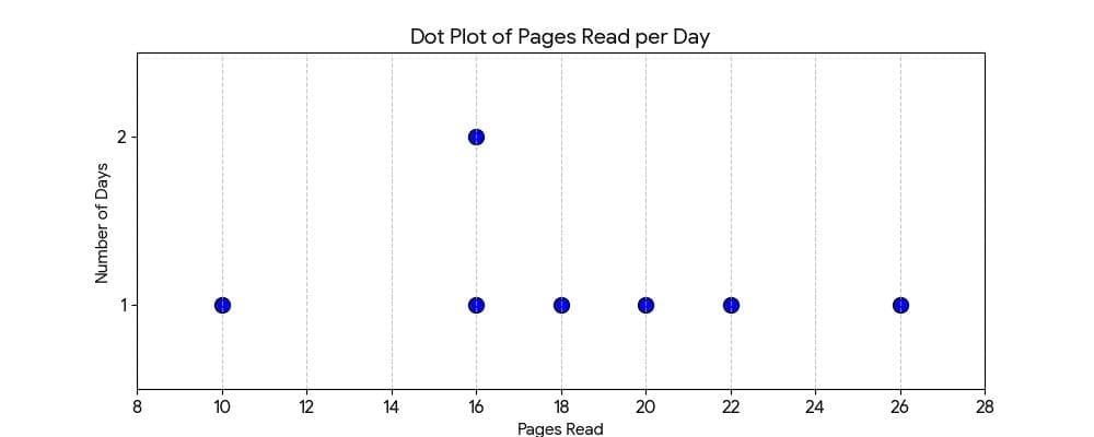
Observations:
– The mean (18.3) and median (18) are very close to each other.
– The value 10 is noticeably lower than the others (possibly the Sunday edition).
– The value 26 is higher (possibly a special or weekend edition).
– The data is fairly symmetric around the centre.
Page No. 109
Math talk
Q: Discuss the effect on the mean and median when outliers are present on both sides. You may take some example data to examine and explain this.
Ans: If outliers are present on both sides, they affect the mean more than the median.
Example data (cm): 120, 125, 158, 160, 162, 165, 168, 200
– Here 120 is a low outlier and 200 is a high outlier.
Mean (Average) = 157.25 cm
Median (Middle) = 161 cm
Effect:
- Mean changes easily because outliers pull it up or down.
- Median does not change much because it depends on the middle value of the ordered list.
Conclusion:
- If outliers lie on both sides, they may partly balance each other, but the mean can still be affected.
- The median is usually more reliable when outliers are present because it resists extreme values.
Page No. 110
Math Talk
Q: How long is a minute?
Two groups of children were asked to estimate the length of 1 minute. They start by closing their eyes and then open when they think 1 minute has passed. Of course, they are not supposed to count while their eyes are closed. The dot plots below show after how many seconds the children opened their eyes.
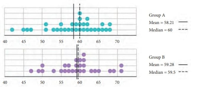
Q: Discuss how well both the groups fared at this activity. Describe and compare the variability in data and their central tendency.
Ans:

Accuracy
– Group A median = 60 sec (exactly 1 minute).
– Group B mean ≈ 59.3 sec (close to 60 on average).
Consistency
– Group B appears more consistent because mean and median are very close and the spread is smaller.
Conclusion
– Group B performed better overall (more accurate and consistent).
– Group A had some early guesses, which increased variability and changed the distribution.
Page No. 112-113
Figure it Out
Q1: Find the median of onion prices in Yahapur and Wahapur.
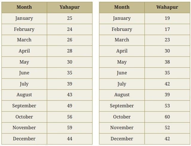
Ans: Monthly onion prices in Yahapur in ascending order:
24, 25, 26, 28, 30, 35, 39, 43, 44, 49, 56, 59
Since there are 12 numbers (an even count), the median is the average of the 6th and 7th numbers.
6th number = 35
7th number = 39
Median = (35 + 39) ÷ 2 = 74 ÷ 2 = 37
Median of onion prices in Yahapur = ₹37/kg
Monthly onion prices in Wahapur in ascending order:
17, 19, 23, 30, 35, 38, 39, 42, 42, 52, 53, 60
Since there are 12 numbers (an even count), the median is the average of the 6th and 7th numbers.
6th number = 38
7th number = 39
Median = (38 + 39) ÷ 2 = 77 ÷ 2 = 38.5
Median of onion prices in Wahapur = ₹38.5/kg.
Q2: Sanskruti asked her class how many domestic animals and pets each had at home. Some of the students were absent. The data values are 0, 1, 0, 4, 8, 0, 0, 2, 1, 1, 5, 3, 4, 0, 0, -, 10, 25, 2, -, 2, 4. Find the mean and median. How would you describe this data?
Ans: Ignoring the missing values, the total data values are 20.
Arranging data values in ascending order:
0, 0, 0, 0, 0, 0, 1, 1, 1, 2, 2, 2, 3, 4, 4, 4, 5, 8, 10, 25
Since there are 20 values (an even number), the median is the average of the 10th and 11th values.
10th value = 2
11th value = 2
Median = (2 + 2) ÷ 2 = 2
Mean = (Sum of the values) ÷ (Total number of values) = 72 ÷ 20 = 3.6
The data shows the number of domestic animals/pets students have at home. Most students have between 0 and 4 pets. There is a wide range with an outlier of 25 at the higher end, which pulls the mean up while the median remains near the centre.
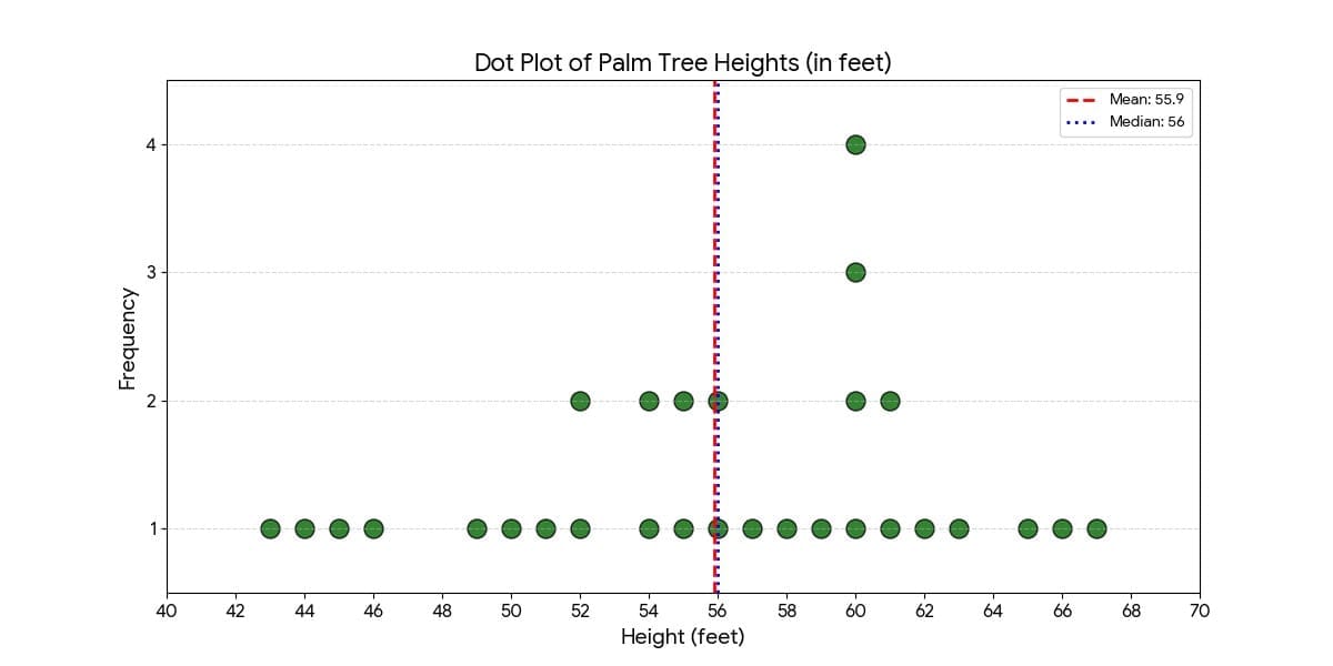
Q3: Rintu takes care of a date-palm tree farm in Habra. The heights of the trees (in feet) in his farm are given as: 50, 45, 43, 52, 61, 63, 46, 55, 60, 55, 59, 56, 56, 49, 54, 65, 66, 51, 44, 58, 60, 54, 52, 57, 61, 62, 60, 60, 67. Fill the dot plot, and mark the mean and median. How would you describe the heights of these palm trees? Can you think of quicker ways to find the mean? How many trees are shorter than the average height?
Ans: The dot plot of the height of trees.
For the median, arrange the heights in ascending order:
43, 44, 45, 46, 49, 50, 51, 52, 52, 54, 54, 55, 55, 56, 56, 57, 58, 59, 60, 60, 60, 60, 61, 61, 62, 63, 65, 66, 67
Total number of trees = 29
For odd number 29 the median is the middle value, which is the 15th term.
So, median = 56 feet
Sum of heights = 1621
Mean = Sum of the heights ÷ Number of trees = 1621 ÷ 29 ≈ 55.90 feet (approximately 55.9 ft)
The height of the date palm trees ranges from 43 to 67 feet, with most trees clustered around 55-60 feet.
The median height is 56 feet, indicating that half the trees are shorter than 56 ft and half are taller.
The mean height is approximately 55.9 feet.
Number of trees shorter than the average height: 13 trees are shorter than 55.9 ft.
Quicker ways to find the mean: group nearby values (for example, group all 60s, 50s, etc.) and multiply by their frequencies to speed up the sum, or use a calculator for the final division.
Q4: The daily water usage from a tap was measured. The usage in litres for the first few days are: 5.6, 8, 3.09, 12.9, 6.5, 12.1, 11.3, 20.5, 7.4.
(a) Can the mean or median daily usage lie between 25 and 30? Justify your claim using the meaning of mean and median.
Ans: The mean or median cannot lie between 25 and 30.
Because the mean is the average of all values, it must lie between the minimum and maximum values, which here are 3.09 litres and 20.5 litres respectively. The median is the middle value and also lies within the range of the data. Since both minimum and maximum are outside 25-30, neither mean nor median can be between 25 and 30.
b) Can the mean or median be lesser than the minimum value or greater than the maximum value in a data?
Ans: No. The mean and median cannot be less than the minimum value or greater than the maximum value in a data set. Both measures must lie within the range of observed values.
Q5: The weights of a few newborn babies are given in kgs. Fill the dot plot provided below. Analyse and compare this data.

Ans: The weight of boys is between 2.6 kg and 4.1 kg.
The weight of girls lies between 2.5 kg and 4 kg.
The heaviest baby in the sample is a boy, and the lightest is a girl.
Q6: The dot plots of heights of another section of Grade 5 students of the same school are shown below. Can you share your observations? What can we infer from the dot plots and the central tendency measures?
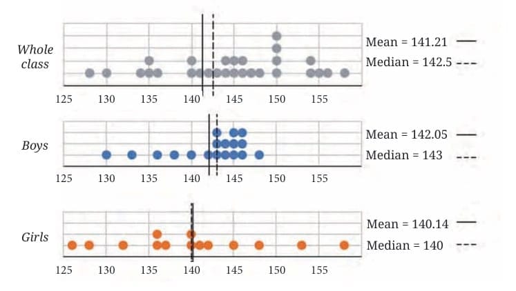
Compare the heights of the two sections. Share your observations.
Ans: We infer the following from the dot plots and the central tendency measures.
The girls’ heights are more spread out and range between 126 cm and 158 cm.
The boys’ heights lie between 130 cm and 148 cm.
Both the tallest and the shortest students in this sample are girls.
Yet, the girls’ average height is slightly less than the whole class average and also less than the boys’ average height in this sample.
We can say that boys are, on average, taller than girls in this class sample.
For boys: mean < median (142.05 < 143) indicates a small influence of lower values.
For girls: mean > median (140.14 > 140) indicates a small influence of higher values.
Comparing this section with the previous example, the students here appear slightly shorter on average.
Q7: The weights of some sumo wrestlers and ballet dancers are:
Sumo wrestlers: 295.2 kg, 250.7 kg, 234.1 kg, 221.0 kg, 200.9 kg Ballet dancers: 40.3 kg, 37.6 kg, 38.8 kg, 45.5 kg, 44.1 kg, 48.2 kg
Approximately how many times heavier is a sumo wrestler compared to a ballet dancer?

Ans: Average weight of Sumo wrestlers = (295.2 + 250.7 + 234.1 + 221.0 + 200.9) ÷ 5 = 1,201.9 ÷ 5 = 240.38 kg (approximately)
Average weight of Ballet dancers = (40.3 + 37.6 + 38.8 + 45.5 + 44.1 + 48.2) ÷ 6 = 254.5 ÷ 6 = 42.42 kg (approximately)
Times heavier ≈ 240.38 ÷ 42.42 ≈ 5.66 ≈ 6 times
A sumo wrestler is approximately 6 times heavier compared to a ballet dancer.
Page No. 118
Q: Identify which of the following statements can be justified using this data.
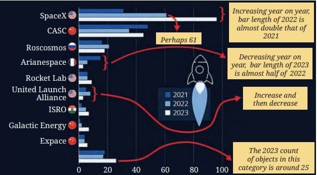
Identify which of the following statements can be justified using the provided bar chart:
(a) All organisations launched more rockets than the previous years.
(b) Only an organisation from the USA launched more than 50 rockets in a single year.
(c) The total number of rockets launched by France in all 3 years is less than 40.
(d) The average number of rockets launched by CASC in these 3 years is around 40.
(e) ISRO launched more rockets than Galactic Energy in these 3 years.
(f) Russia launched more than 60 rockets in these 3 years.
Ans:
- (a) Not justified: Arianespace and United Launch Alliance launched fewer rockets in 2023 than in 2022.
- (b) Justified: SpaceX (USA) is the only organisation whose bar exceeds the 50 mark in a year.
- (c) Justified: The three yearly bars for Arianespace are all well below 20, so their total over 3 years is less than 40.
- (d) Not justified: The bars for CASC are consistently at or above 40, so the average is not around 40; it is higher.
- (e) Justified: The total length of ISRO’s bars is visually greater than Galactic Energy’s across the three years.
- (f) Justified: Each yearly bar for Roscosmos is roughly 20, so the three-year total is about 60 or slightly more.
Q: List the organisations that have consistently launched more rockets every year.
Ans:
- SpaceX
- CASC
- Rocket Lab
- ISRO
- Galactic Energy
- Expace
Q: Estimate the total number of rockets launched worldwide in 2023.
(a) less than 200
(b) 200 to 400
(c) 400 to 600
(d) more than 600
Ans: (b) 200 to 400
Reasoning: SpaceX is nearly 100, CASC is about 60, and the other agencies together add up so that the total is clearly between 200 and 400.
Q: What are you curious to know after looking at this graph?
Ans:
- Why did SpaceX’s bar almost double in 2022 compared to 2021?
- Why did Arianespace’s 2023 count drop to almost half of its 2022 count?
- Why does the USA have a significantly higher launch volume than other nations?
Q: Answer the following questions based on the graph:
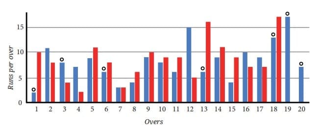
Q1: Can we tell who batted first? Who won the match?
Ans:
- Batted First: No. The graph does not give information about the order of innings; it only shows runs per over for both teams for comparison.
- Who won: It is difficult to tell for certain without adding up the runs over all 20 overs for each team. Visually, the Red team seems to have higher peaks in several overs and fewer very low-scoring overs, so they may have a higher total.
Q2: How many runs did the blue team score in over 12?
Ans: In over 12, the blue bar reaches the line marked 15. Since the scale is 1 unit = 5 runs, the blue team scored 15 runs in that over.
Q3: In which over did the red team score the least number of runs?
Ans: The red team scored the least number of runs in over 4, where their bar is the shortest on the graph.
Q4: Is it easy to tell the target set by the team batting first?
Ans: No. To find the target you would need to estimate and add the height of every bar for that innings, which is time-consuming and prone to estimation error from a bar graph. A table of runs per over would be better for an exact total.
Figure it Out
Q1: The following infographic shows the speeds of a few animals in air, on land, and in water. Can we call this graph a bar graph?
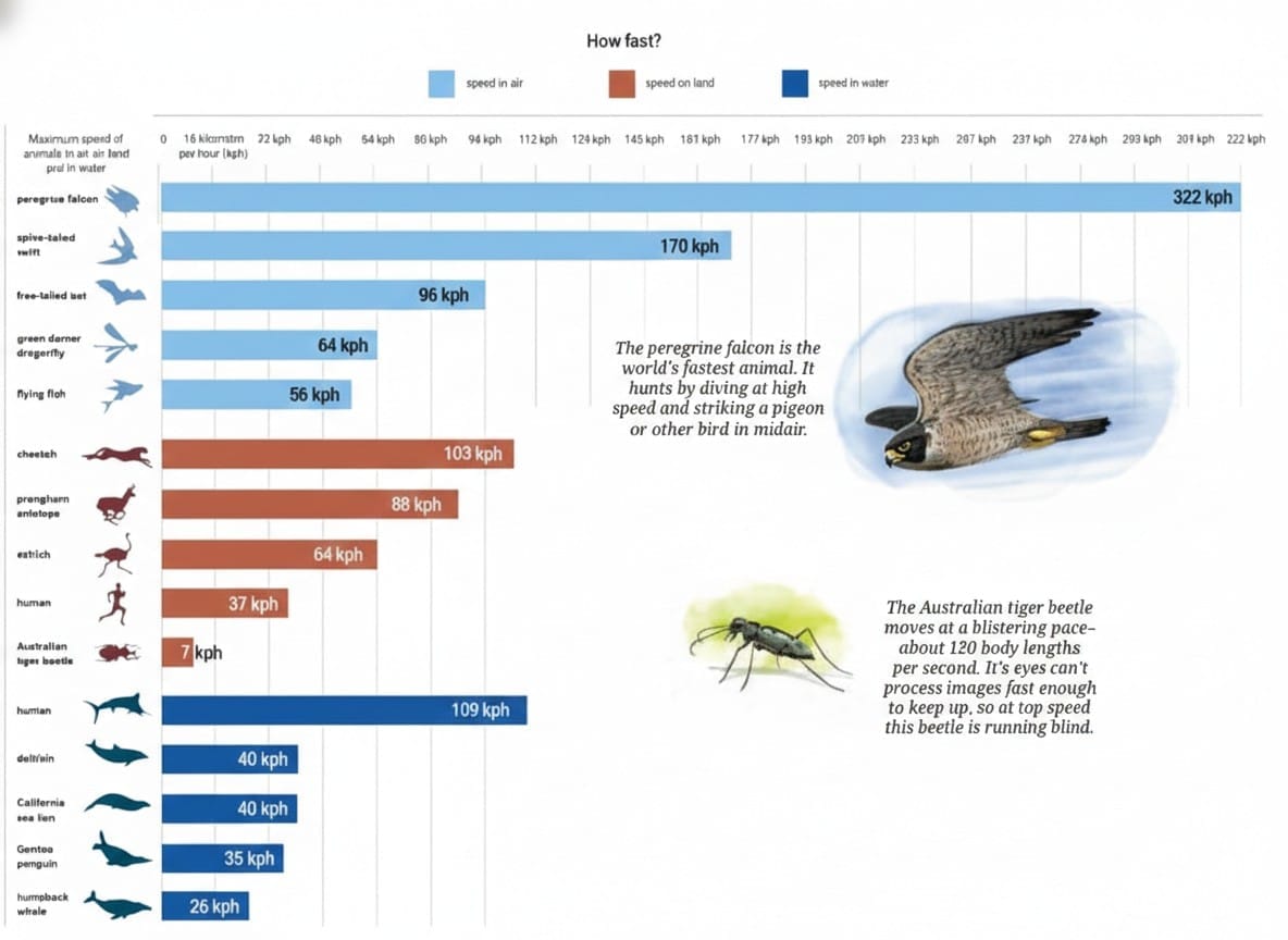
(a) What is the scale used in this graph?
Ans: The scale used is 1 unit = 16 km/hr.
b) What did you find interesting in this infographic? What do you want to explore further?
Ans:
Interesting findings:
- The Peregrine falcon is incredibly fast: at nearly 390 km/hr, it is the fastest animal shown – faster than most cars on a highway.
- Different environments give different speed limits: animals adapted to air, land, or water show very different top speeds due to their body shapes and the resistance of the medium.
What to explore further:
- Why is the Peregrine falcon so fast? Which body features help achieve such speed?
- How does water resistance limit speed compared with air and land?
c) Identify a pair of creatures where one’s speed is about twice that of the other.
Ans: The cheetah (103 km/hr) is about twice as fast as the flying fish (56 km/hr).
(d) Can we say that a sailfish is about 4 times faster than a humpback whale? Can we say that a sailfish is the fastest aquatic animal in the world?
Ans: Yes, the sailfish (about 109 km/hr) is roughly 4 times faster than the humpback whale (about 26 km/hr) because 26 × 4 = 104, which is close to 109.
However, we cannot claim the sailfish is the fastest aquatic animal in the world from this infographic alone; it is only the fastest among the animals shown.
Q2: Preyashi asked her students ‘If you were to get a super power to become aquatic (water-borne), aerial (air-borne), or spaceborne which one would you choose?’. The responses are shown below. Some chose none. Draw a double-bar graph comparing how both grades chose each option. Choose an appropriate scale.

where: w = aquatic (water), a = aerial (air), s = spaceborne, n = none
Ans:
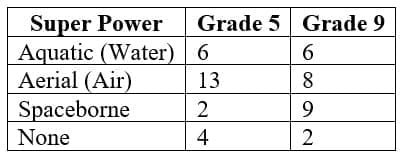
- Maximum value = 13 students; Minimum value = 2 students.
- Chosen scale: 1 unit = 2 students (this gives clear separation); alternatively 1 unit = 1 student for full precision.
Double-bar graph
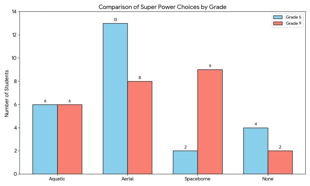
Analysis and Observations
- Aerial is most popular in Grade 5: 13 out of 25 students (52%).
- Spaceborne is most popular in Grade 9: 9 out of 25 students (36%), much higher than Grade 5’s 2 students.
- Aquatic preference is equal: both grades had 6 students choosing aquatic.
- “None” decreases with age: Grade 5 had 4 students choosing none, while Grade 9 had 2.
- Interest shifts with age: younger students prefer flying, while older students show more interest in space travel.
Q3: The temperature variation over two days in different months in Jodhpur, Rajasthan, is given below. Draw a double-bar graph. Use the scale 1 unit = 4°C. Can you guess which two months these days might belong to?
Ans:
Step 1: Create the double-bar graph
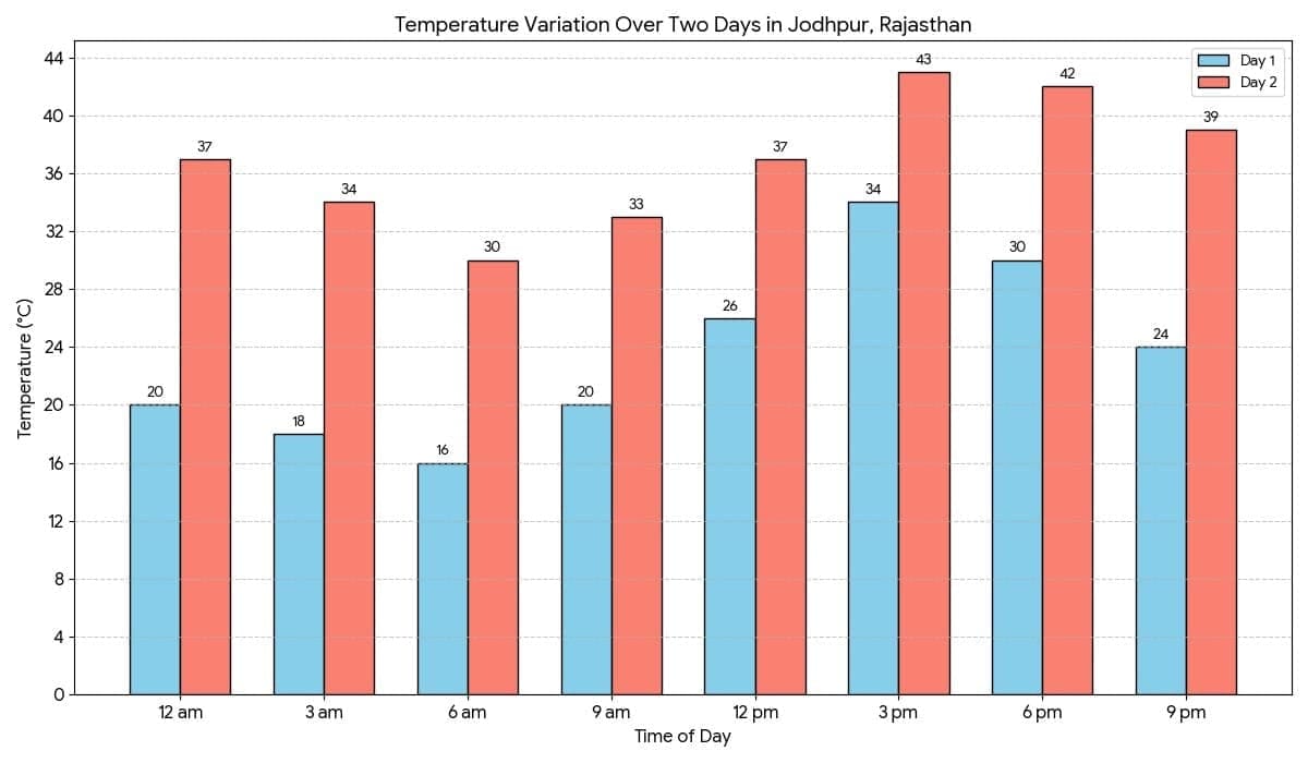
Observations:
Day 1: Minimum 16°C, Maximum 34°C, Range 18°C – cool morning and warm afternoon.
Day 2: Minimum 30°C, Maximum 43°C, Range 13°C – hot all day and very hot in the afternoon.
These days might belong to December (cooler day) and May (hot day) respectively.
Q4: The following clustered-bar graph shows the number of electric vehicles registered in some states every year from 2022 to 2024.
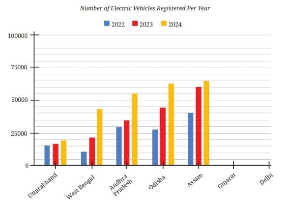
(a) The data (rounded-off to thousands) for the states of Gujarat and Delhi are given in the table below. Mark the corresponding bars on the bar graph. (It is enough if you place the top of the bars between the two appropriate vertical guidelines.)
Ans:
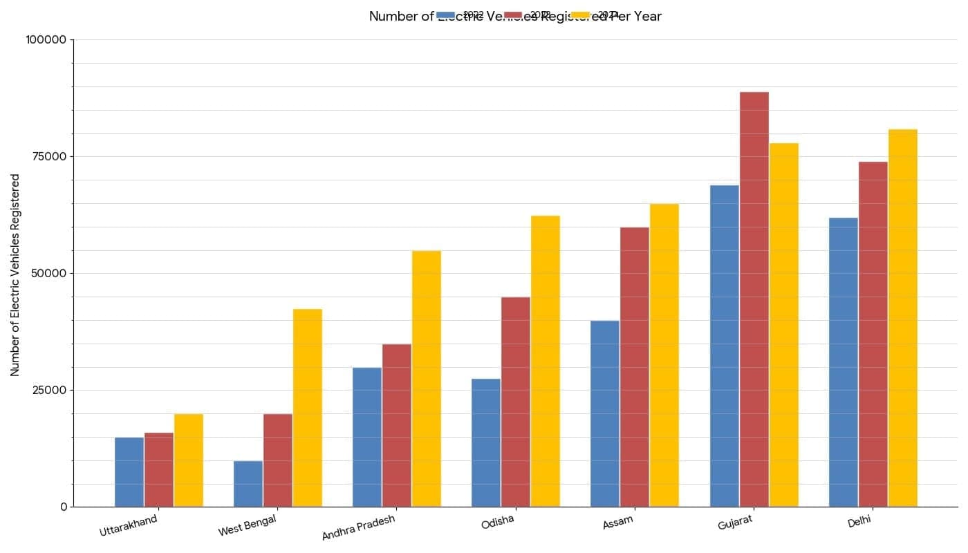
(b) Notice how the graph is organised, what scale is used, and what patterns the data shows.
Ans: Scale: The y-axis uses a scale of 1 unit = 25,000 registrations.
(c) How would you describe the change for various states between 2022 and 2024?
Ans: (i) Most states show an increasing trend in electric vehicle registrations from 2022 to 2024.
(ii) Delhi and Gujarat have the highest number of registrations among the states shown.
(iii) Uttarakhand has the lowest number of registrations.
(iv) On average, registrations increase year by year across most states; Assam and Andhra Pradesh show notable growth.
(d) Approximately how many more registrations did Assam get in 2023 compared to 2022?
Ans:
- In 2022, Assam had approximately 40,000 registrations.
- In 2023, registrations increased to approximately 60,000.
- Answer: Assam received approximately 20,000 more registrations in 2023 compared to 2022.
(e) How many times more did the registrations in West Bengal increase from 2022 to 2024?
Ans:
- In 2022, registrations were approximately 10,000.
- In 2024, registrations grew to approximately 40,000.
- Answer: Registrations in West Bengal increased approximately 4 times from 2022 to 2024.
(f) Is this statement correct – ‘There were very few new registrations in Uttarakhand in 2023 and 2024, as the increase in the bar lengths is minimal’?
Ans: The statement is correct.
Page No. 125-126
Math Talk
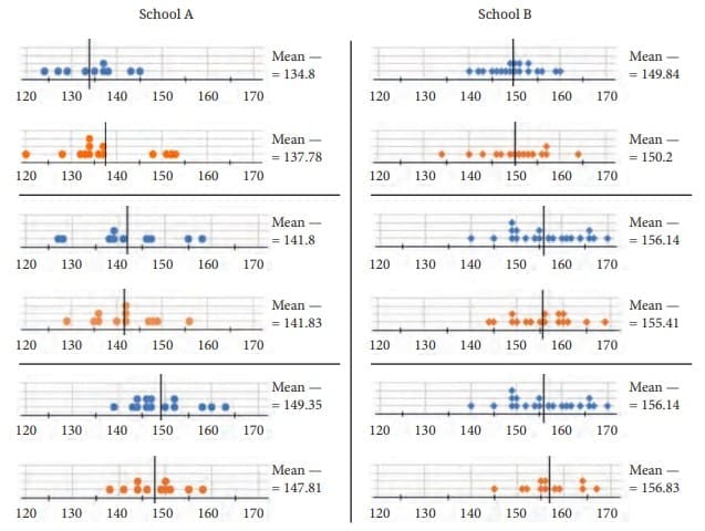
Q: What do you notice about the dot plots of heights of boys and girls of Grades 6, 7 and 8 from the two schools? Share your observations.
Ans:
Here are some observations we can make:
- In both schools, the mean height tends to increase as grade increases (from Grade 6 to Grade 8), which is expected as children grow older.
- School B students are taller on average than School A students in every grade shown. For example, in Grade 6 the boys’ mean in School A is 134.8 cm while in School B it is 141.83 cm (as given).
- In both schools, boys and girls have similar average heights in Grade 6, but differences grow in higher grades.
- Spread (variability) differs: one school may have heights clustered tightly while the other shows more spread.
- School B’s students are consistently taller than School A’s across the grades shown; this could be due to factors such as nutrition, environment, or sample differences.
Page No. 127
Math Talk
Q: Which of the following statements can be justified using the data?
Ans:
Statement 1: “The average heights of both boys and girls at every age increased from 1989 to 2019.”
Checking the table: For every age from 5 to 19, the boys’ height in 2019 is greater than in 1989, and the girls’ height in 2019 is also greater than in 1989. For example, at age 5: boys went from 101.3 cm (1989) to 107.1 cm (2019); girls went from 100 cm to 107.2 cm.
This statement is TRUE. It can be justified using the data.
Statement 2: “The average height of 13-year-old girls in 1989 is more than the average height of 14-year-old girls in 2009.”
From the table: 13-year-old girls in 1989 = 143.2 cm. 14-year-old girls in 2009 = 148 cm. Since 143.2 < 148, the statement is false.
This statement is FALSE. It cannot be justified.
Statement 3: “The average height of 15-year-old boys in 2019 is more than the average height of 16-year-old boys in 1989.”
From the table: 15-year-old boys in 2019 = 159 cm. 16-year-old boys in 1989 = 158.9 cm. Since 159 > 158.9, the statement is true.
This statement is TRUE. It can be justified using the data.
Statement 4: “All girls aged 13 are taller than all girls aged 11.”
The table gives only average (mean) heights, not heights of individual girls. Some 11-year-old girls could be taller than some 13-year-old girls. We cannot make a statement about ‘all girls’ using only averages.
This statement is FALSE. It cannot be justified.
Statement 5: “Throughout the age period 5 to 19, the average boy height is more than the average girl height.”
Checking the 2019 data: At age 10, boys = 132.6 cm but girls = 132.8 cm (girls are slightly taller); at ages 11 and 12 girls are also slightly taller. So the statement is false for some ages.
This statement is FALSE. It cannot be justified.
Statement 6: “Boys keep growing even beyond age 19.”
The data ends at age 19. There is no information beyond age 19, so we cannot conclude about growth after 19 from this table alone.
This statement CANNOT be justified. The data does not provide information beyond age 19.
Page No. 129
Figure it Out
Q1:The dot plots below show the distribution of the number of pockets on clothing for a group of boys and for a group of girls.
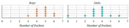
Ans: (a) False
(b) True
(c) False
(d) True
Q2: The following table shows points scored by each player in four games:
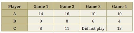
(a) Find the average number of points scored per game by A.
(b) To find the mean number of points scored per game by C, would you divide the total points by 3 or by 4? Why? What about B?
(c) Who is the best performer?
Ans: (a) Average number scored per game by A = (14 + 16 + 10 + 10) ÷ 4 = 50 ÷ 4 = 12.5
(b) Player C did not play game 3, so C played 3 games only; divide C’s total points by 3 to find C’s mean. Player B played all four games, so divide B’s total by 4.
(c) Player A has the highest average (12.5) and is the best performer by mean score.
Page No. 130
Q3: The marks (out of 100) obtained by two groups in a General Knowledge quiz are given below. Compare and describe both groups’ performance using mean and median.
Group 1 scores: 85, 76, 90, 85, 39, 48, 56, 95, 81, 75 (10 students)
Group 2 scores: 68, 59, 73, 86, 47, 79, 90, 93, 86 (9 students)
Ans:
Group 1:
Number of students = 10
Sum of marks = 85 + 76 + 90 + 85 + 39 + 48 + 56 + 95 + 81 + 75 = 730
Mean = 730 ÷ 10 = 73
Arranged marks: 39, 48, 56, 75, 76, 81, 85, 85, 90, 95
Median = average of 5th and 6th scores = (76 + 81) ÷ 2 = 78.5
Group 2:
Number of students = 9
Sum of marks = 68 + 59 + 73 + 86 + 47 + 79 + 90 + 93 + 86 = 681
Mean = 681 ÷ 9 = 75.67 (approximately)
Arranged marks: 47, 59, 68, 73, 79, 86, 86, 90, 93
Median = 5th score = 79
Comparison:
– Group 2 has a higher mean (≈75.7) and a higher median (79) than Group 1 (mean 73, median 78.5).
– Group 2 performs slightly better on average and in the centre of the distribution. Group 1 has more spread with a lower minimum score but some very high scores too.
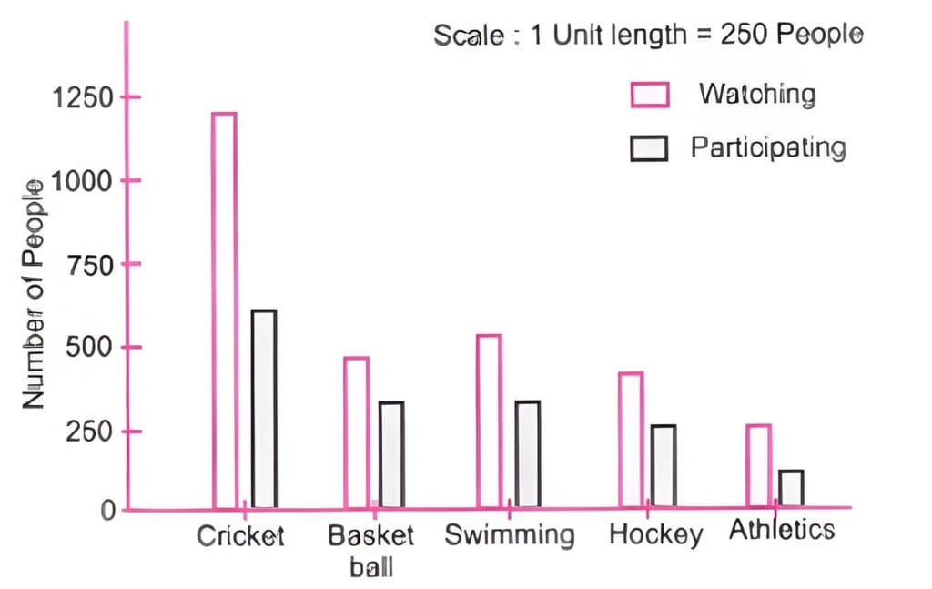
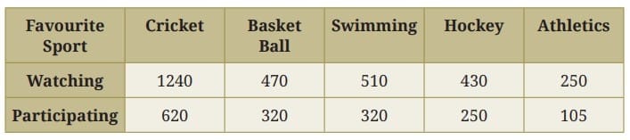
Q4: Choose an appropriate scale and draw a double-bar graph for the favourite-sport survey data. Write down your observations.
Ans:
Observations:
Cricket is the most popular sport for both watching and participating.
More people watch sports than participate in them across all categories.
Athletics has the lowest numbers for both watching and participating.
Basketball and swimming have similar participation numbers, but more people watch swimming than basketball.
Q5: 17 students have the following heights (in cm): 106, 110, 123, 125, 117, 120, 112, 115, 110, 120, 115, 102, 115, 115, 109, 115, 101. The sports teacher wants to divide the class into two equal groups based on height. Suggest a way to do this. Can you guess the age of these students?
Ans: 17 is an odd number and cannot be split into two perfectly equal groups of whole students. A common method is to use the median height to split the class so that one group has students shorter than the median and the other has students taller than or equal to the median.
Arrange the heights in order:
101, 102, 106, 109, 110, 110, 112, 115, 115, 115, 115, 115, 117, 120, 120, 123, 125
With 17 values, the median is the 9th term = 115 cm.
So a sensible split is:
Group 1 (shorter than 115 cm): 101, 102, 106, 109, 110, 110, 112, 115 – 8 students.
Group 2 (115 cm or taller): 115, 115, 115, 115, 117, 120, 120, 123, 125 – 9 students.
Alternatively, if the teacher wants groups as equal as possible, they could choose the two students closest to median and redistribute one student to balance numbers. The ages of these students (given heights around 100-125 cm) are likely around 9-11 years, but this is only an estimate.
Q6: Describe the mean and median of heights of your class. You can visualise the heights on a dot plot.
Ans: Do it yourself.
Q7. There are two 7th grade sections at a school. Each section has 15 boys and 15 girls. In one section, the mean height of students is 154.2 cm. From this information, what must be true about the mean height of students in the other section?
(a) The mean height of students in the other section is 154.2 cm.
(b) The mean height of students in the other section is less than 154.2 cm.
(c) The mean height of students in the other section is greater than 154.2 cm.
(d) The mean height of the students’ section cannot be determined
Ans: (d) The mean height of the students’ section cannot be determined
Page No. 131
Q8: Standing Tall in the Storm – Skyscrapers
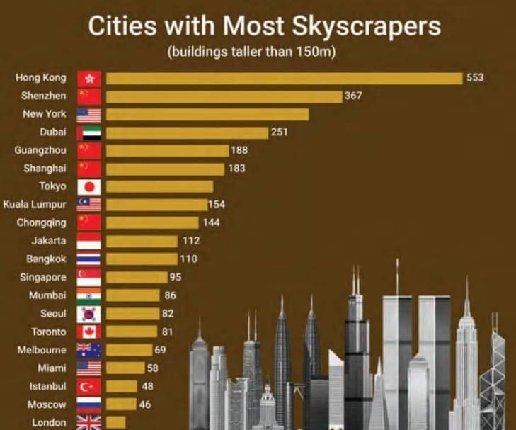
(a) Write estimated values for the number of skyscrapers in New York, Tokyo, and London.
(b) Are the following statements valid?
(i) Only 12 cities have more skyscrapers than Mumbai.
(ii) Only 7 cities have fewer skyscrapers than Mumbai.
(iii) The tallest building in the world is in Hong Kong.
Ans: (а) Estimated values for the number of skyscrapers in
New York – 305
Tokyo – 160
London – 38
(b) (i) Valid
(ii) Valid
(iii) Invalid
Q9: Estimate and then measure the objects listed in the table. Draw a double bar graph. How accurate were your estimates? Find the average difference between the estimated and measured values.
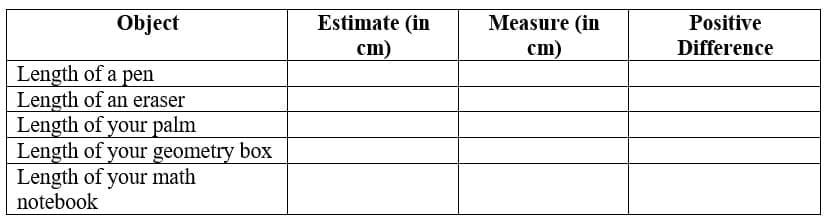
Ans:
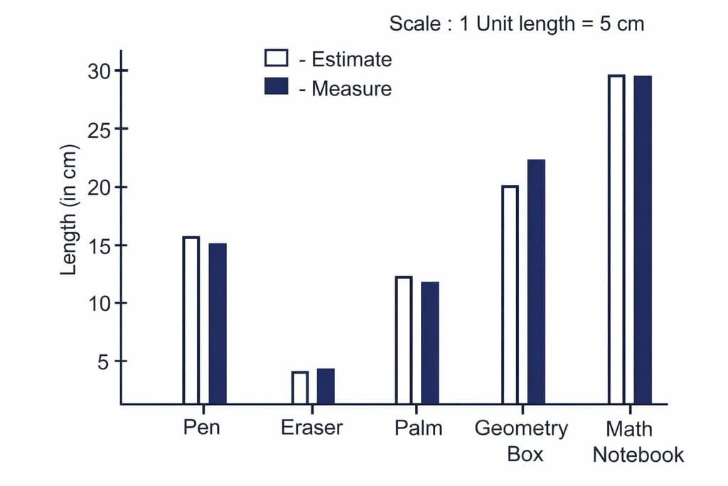
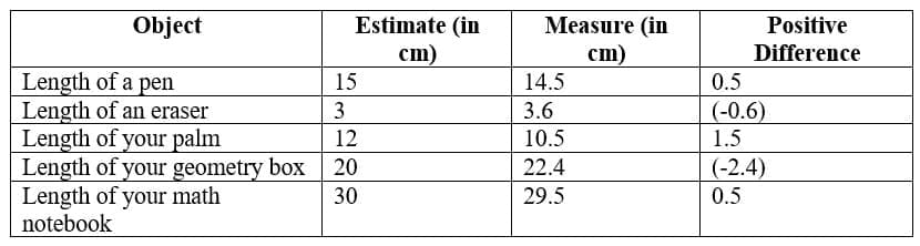
Sum of differences = 0.5 + (-0.6) + 1.5 + (-2.4) + 0.5 = -0.5
Average difference = -0.5 ÷ 5 = -0.1 cm
On average, estimated values were 0.1 cm less than actual values.
Page No. 132
Q10: Aditi likes solving puzzles. She recently started attempting the ‘Easy’ level Sudoku puzzles. The time she took (in seconds) to solve these puzzles are – 410, 400, 370, 340, 360, 400, 320, 330, 310, 320, 290, 380, 280, 270, 230, 220, 240. The first nine values correspond to Week 1 and the rest to Week 2.
(a) Construct a dot plot below showing the data for both weeks.
(b) Describe the mean, median, and any observations you may have about the data.
Ans:
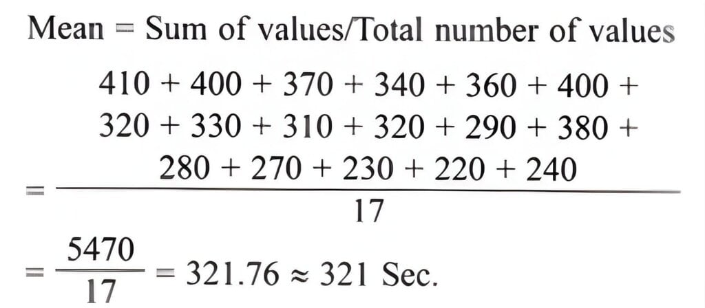
Arranging in ascending order:
220, 230, 240, 270, 280, 290, 310, 320, 320, 330, 340, 360, 370, 380, 400, 400, 410
With 17 values, the median is the 9th value.
So median = 320 sec
Observations and description:
– Median = 320 seconds, showing the centre of the data.
– Times in Week 2 (later values) are generally smaller than Week 1, indicating improvement (Aditi solved puzzles faster in Week 2).
– The data shows a spread from 220 sec to 410 sec, and the presence of both faster and slower times suggests variation in puzzle difficulty or in Aditi’s practice. A mean (calculated by summing all times and dividing by 17) would give the average time; the median shows central tendency that is less affected by extreme long times such as 410.
Individual & Group Projects
Q11: Individual Project: Pick at least one of the following:
(a) How long is a sentence? Pick any two textbooks from different subjects. Choose any page with a lot of text from each book.
(i) Use a dot plot to describe how many words the sentences have on each page.
(ii) Compare the data of both pages using mean and median.
(b) What is in a Name? Write down the names of all of your classmates. The following are some interesting things you can do with this data!
(i) Find the mean and median name length (number of letters in a name).
(ii) Visualise the data and describe its variability and central tendency.
(iii) Which starting letters are more popular? Which are less popular?
(iv) What is the median starting letter? What does this say about the number of names starting with the letters A-M and N-Z?
(v) Plot a double-bar graph showing the number of boys’ names and girls’ names that:
- Start and end with vowels,
- Start with vowels and end with consonants,
- Start with consonants and end with vowels,
- Start and end with consonants.
Sol: Do yourself.
Q12. Individual Project (long term): This requires collecting data over 2 weeks or more.
In and Out: Track how many times you step out of your house in a day. Do this for a month.
(i) Describe the variability and central tendency of this data. Make a dot plot.
(ii) Do you find anything interesting about this data? Share your observations.
(iii) You can ask any of your family members or friends to do this as well.
Sol: Do yourself.
Q13. Small-group project: Pick at least one of the following. Make groups of 8 to 10. Collect data individually as needed. Put together everyone’s data and do the appropriate analysis and visualisation.
(a) Our heights vs. our family’s heights: Collect the heights of your family members.
(i) Make a dot plot showing the heights of just your family members. Describe its variability and central tendency.
(ii) Make a double-bar graph showing each student’s height next to their family’s mean height.
(iii) Look at everyone’s data and share your observations.
(b) Estimating time: Check the time and close your eyes. Open them when you think 1 minute has passed (no counting). Note down how many seconds you opened your eyes. Collect this data for yourself and for your family members. Repeat this activity to estimate 3 minutes.
(i) Make two dot plots (for 1 minute and 3 minutes) showing estimates of just your family members.
(ii) Mark these on the respective dot plots. Describe its variability and central tendency.
(iii) Make a double bar graph showing each family’s mean 1-minute estimate and mean 3-minute estimate.
(iv) Look at everyone’s data and share your observations.
Sol: Do yourself.